
NEUROFLY
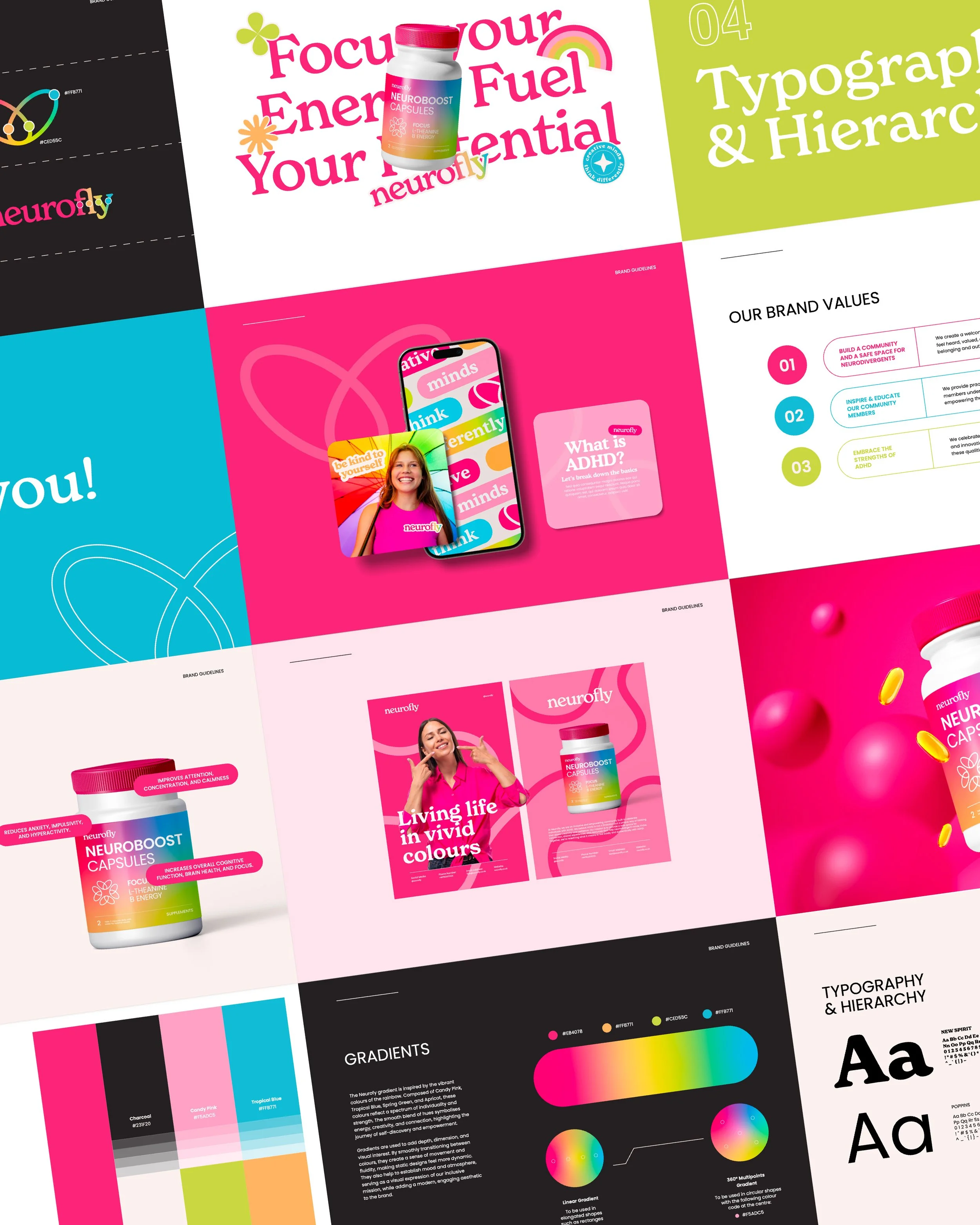
Brand Identity
Packaging Design
Social Media Templates
SERVICES
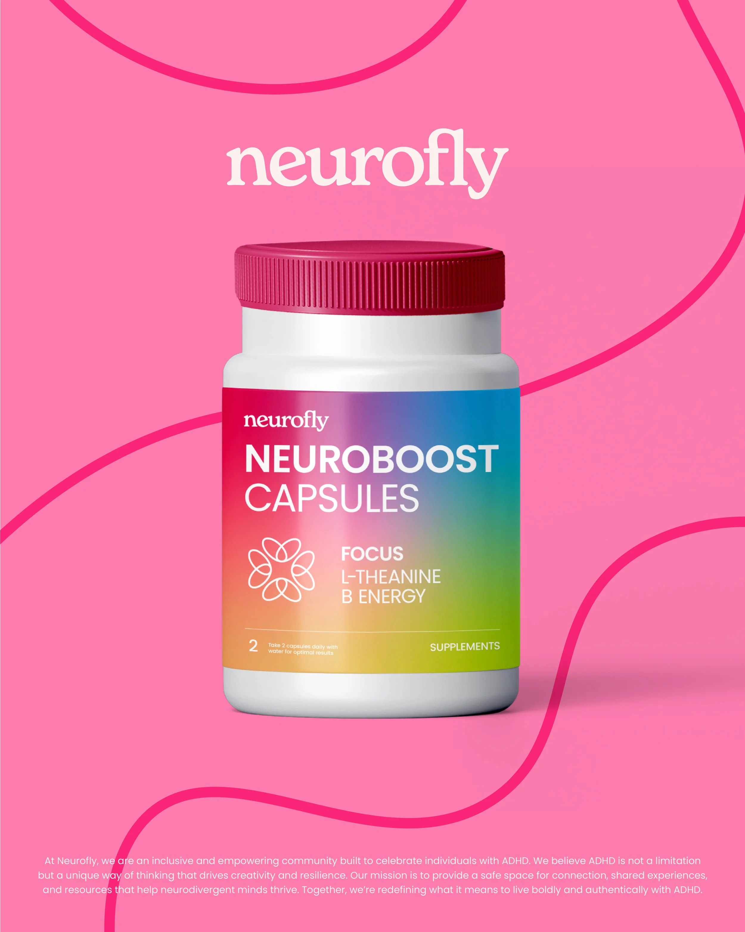
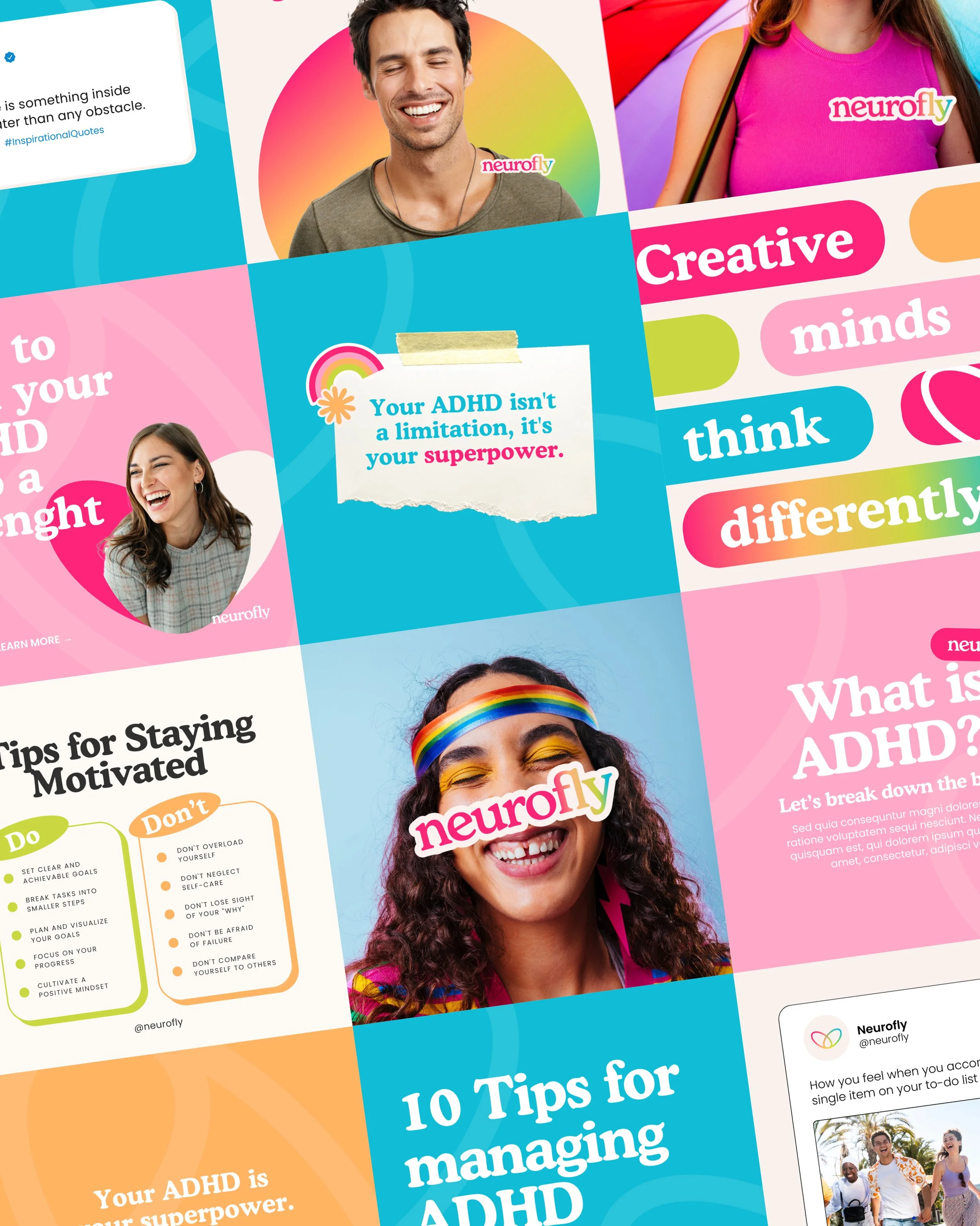
The challenge for this UK-based ADHD community and supplement brand was to create a clear, inclusive, and supportive visual identity for a neurodivergent audience. The goal was to design a system that feels open, positive, and easy to recognise, while reflecting the diversity of neurodivergence. The visual language needed to balance clarity with strong emotional impact, making the brand feel both trustworthy and empowering.
CHALLENGE
RESULTS
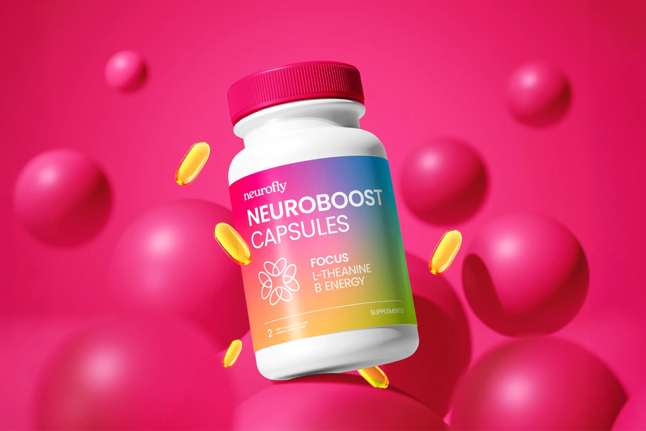
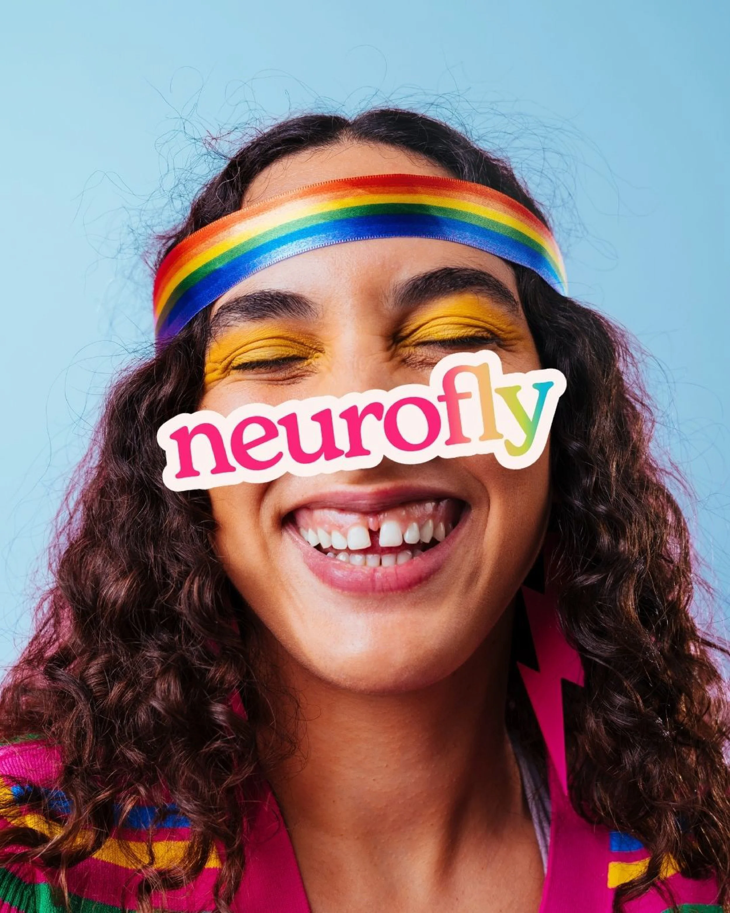
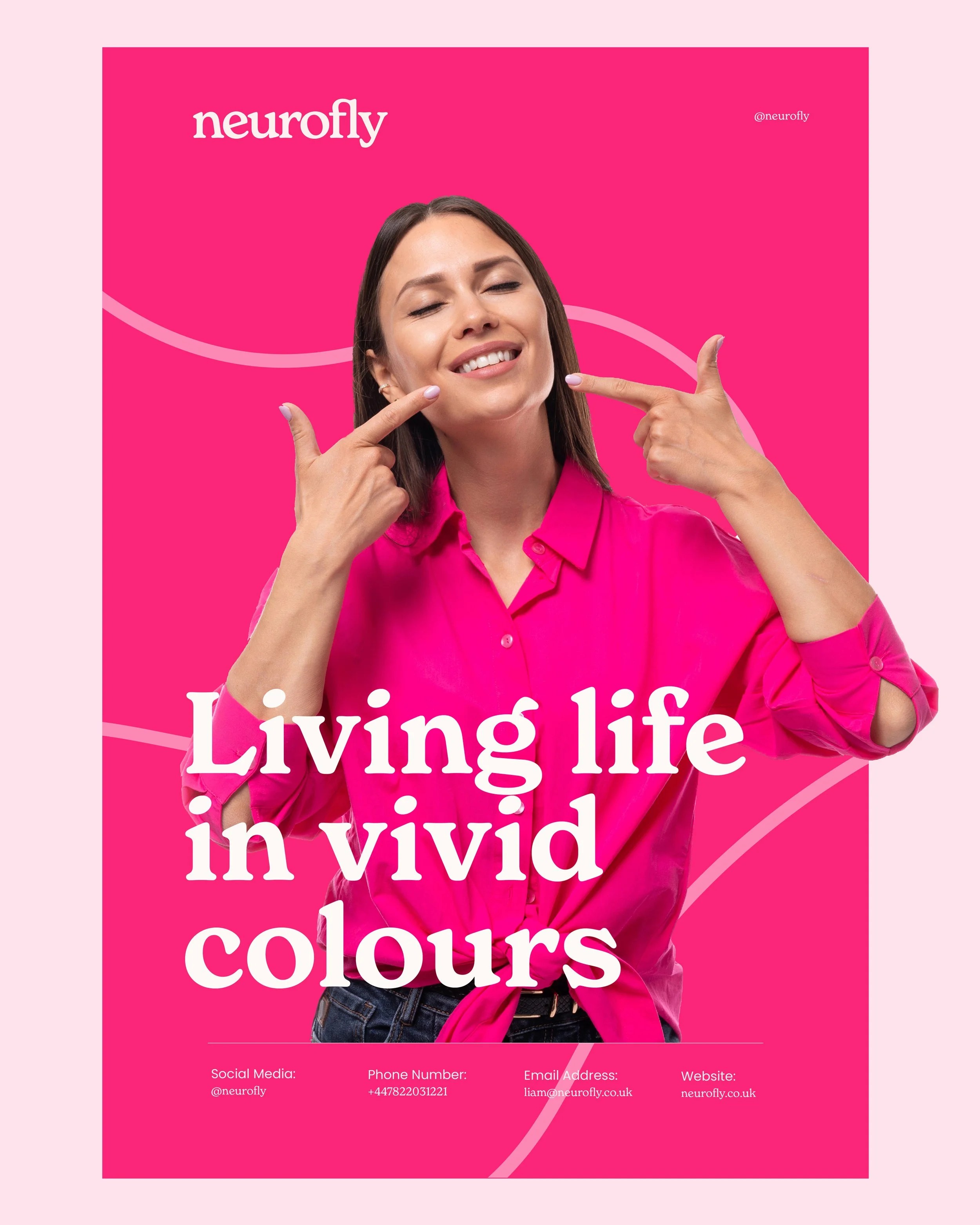
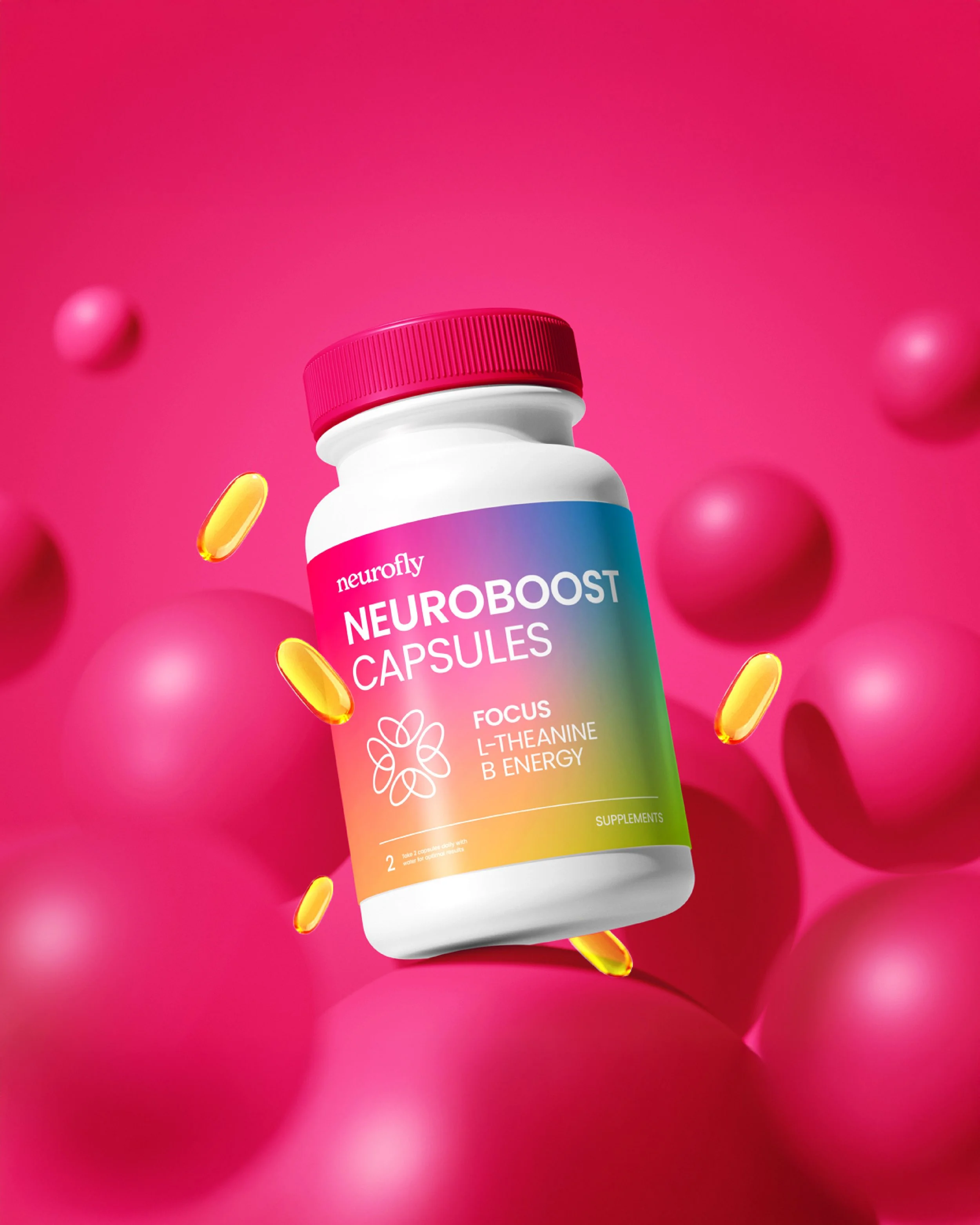
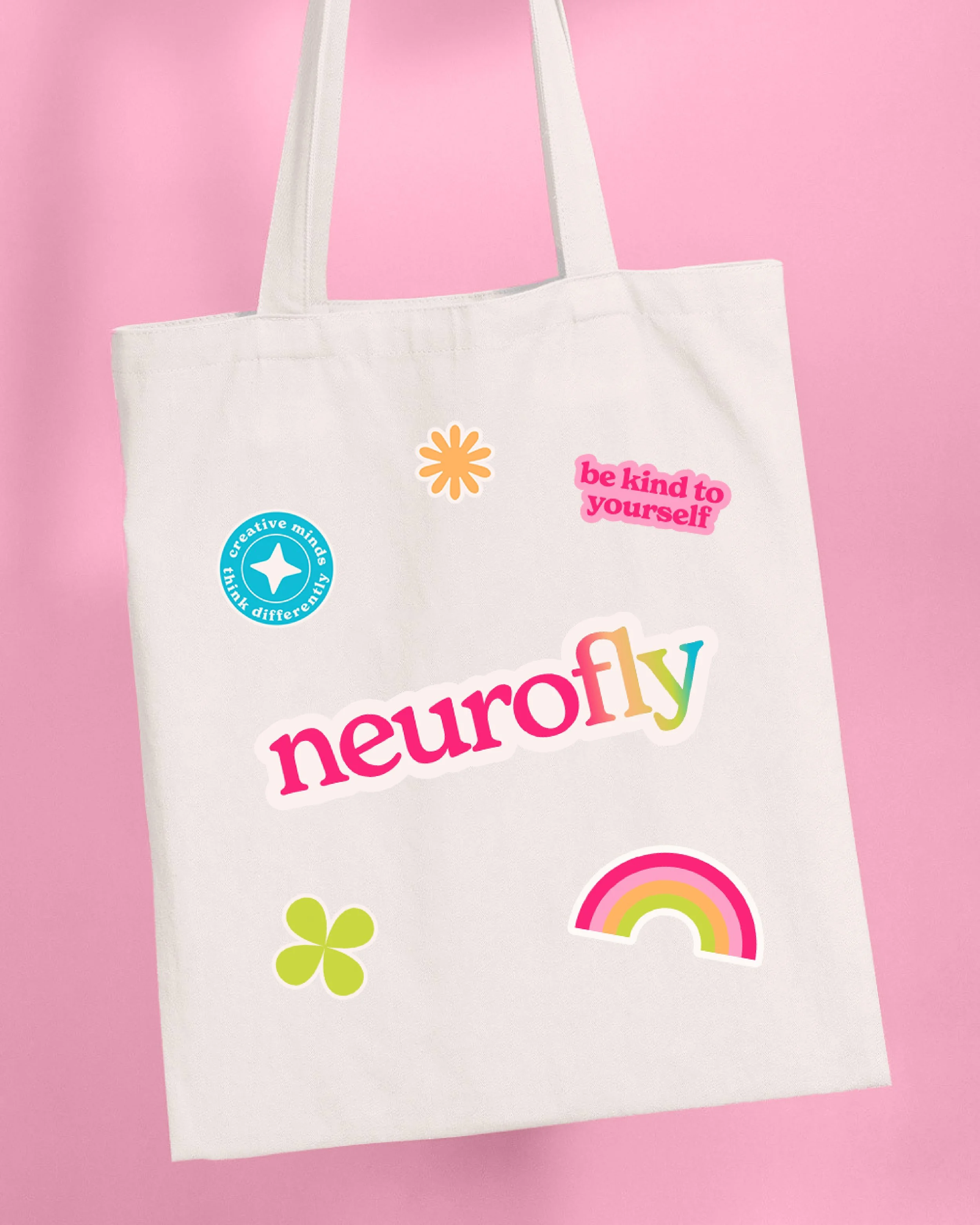
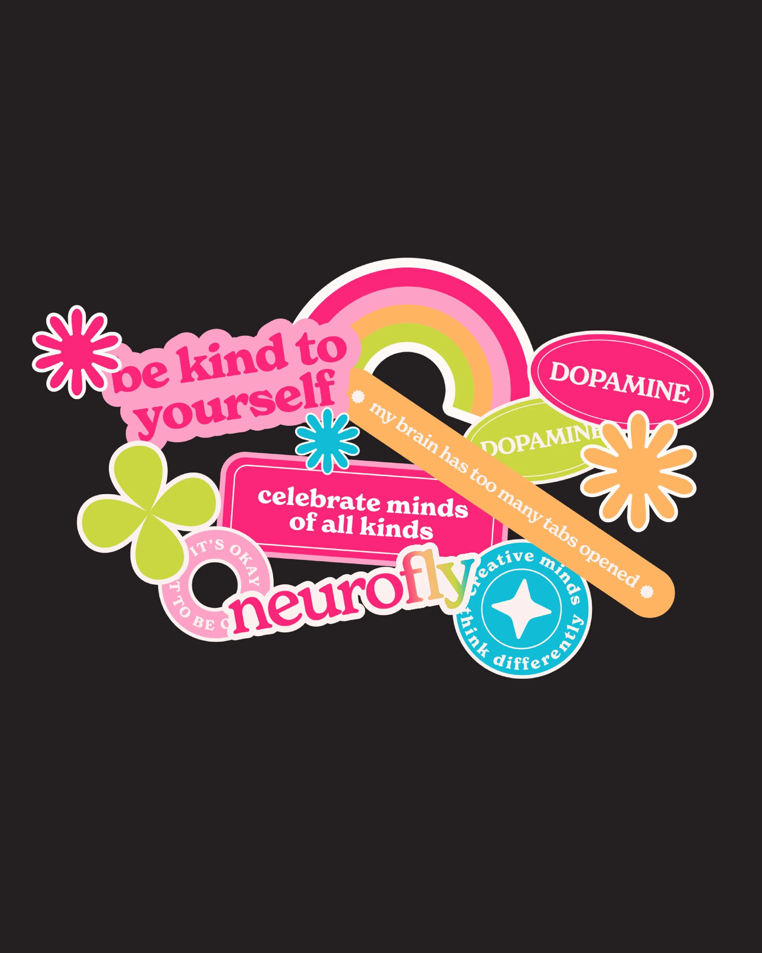
The result is a bold and highly expressive brand identity built around a rainbow colour system, symbolising neurodiversity and inclusion. The logo and visual elements use strong, vibrant colours to create instant recognition and emotional connection. Custom sticker designs were developed to extend the brand language, using a playful but structured visual style. Overall, the identity feels energetic, supportive, and clearly positioned within the ADHD community space.
